Monday, 17 December 2012
Record Company Logo
This is our design for our record company. This is what I will use to refer to when producing the logo on photoshop.
Thursday, 13 December 2012
Digipack Advert
This is the digipack magazine advert I have produced on photoshop. In order to make it look professional, I have watched various youtube tutorials in order to create a professional and sleek look, The majority of these tutorials have shown me how to use the opacity and filter settings on photoshop. By learning how to do these professional techniques, I have manipulated certain shapes and objects in order to create the spacial background for the digipack. For the font I downloaded a pre-existing font from dafont and then extracted it to the fonts folder in order to use it on my poster. For the stars, I search on google for "stars" and found a fitting image, after copying and pasting the design on my background, I used the magic wand tool to get rid of the background after doing this I used the contrast/brightness and colour settings in order to make the yellow stars white, in order for them to suit the environment of the poster. For each of the retail sellers logos, I simply searched for each of them on google after doing this I resized them and used the magic wand to delete any of the white spaces in the backgrounds. In order to give it a sleek look I uploaded a pre-made image of our fictional recording company and pasted it on the background. After adding all of the images, I started to add the text. For the text, I simply used the downloaded font, after doing this I changed the text colour to white and started to enter things such as reviews and the titles. When I had finished the text, I asked my group member if he would create a digipack album cover for me to include in the advert, after doing so he sent me the image in order for me to use it in the advert. After pasting it onto the background I resized it and aligned everything in order for it to look neat and tidy.
Recording Company Logo
This is the logo for our fictional record company 'Avalanche Records' that I have produced on photoshop. For this graphic, I tried using tools and image processes that I haven't used much in the past. I looked at online tutorials to learn how to use the the colour balance tools correctly to achieve the saturated look of the image. I also used the opacity tools built into photoshop to make the triangle graphic I made translucent.
Thursday, 6 December 2012
Wednesday, 5 December 2012
Friday, 30 November 2012
Interesting Music Videos
I particularly find this video interesting because it creates a surreal environment through its use of clever ideas and abstract objects. I could maybe use a couple of ideas from this video to use in mine, due to them both sharing similar and surreal elements. I especially like the way the video captures the audiences attention by having things appear at random, this especially diverts away from the cliched videos which are shown on music channels.
I find this video interesting because it uses fast paced imagery to create a sense of surrealism. I believe that I can take a few ideas from this video such as the eclectic themes and colourful scenery, I also like how they've used the green screen to create surrealism as well as to create a fun atmosphere.
Thursday, 29 November 2012
Wednesday, 28 November 2012
Friday, 23 November 2012
Friday, 16 November 2012
Friday, 26 October 2012
Friday, 19 October 2012
Thursday, 18 October 2012
Song Choice
Monday, 15 October 2012
Wednesday, 3 October 2012
Advert Analysis
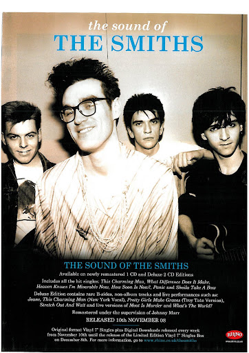
The magazine advert that I've decided to look at is The Smiths. I can see that from this image the main focus is the band, due to the whole band covering the advert. the bands name is also at the top of the advert in bold characters showing the audience that this band are pretty important, due to their name being in block capitals, block capitals have been used in order . The De-saturation shows that this band are gritty and deal with forms of realism in their lyrical content. I can also see that behind the singer the other band members are holding a permanent frown. The hairstyle of each band member also shows me that they are from the 80's and can categorized into the indie genre. I believe that this advert is aimed at a more independent audience, mainly because the band disinterested, which sort relates to that rock-star lifestyle of not caring, I also believe that this Image is aimed at long time fans of the band because in the text is states that this CD has all of their B-sides on it. I also believe that they are trying to appeal to a mainstream audience as well because it states that the CD is full of their hit singles.
Monday, 1 October 2012
Subscribe to:
Posts (Atom)


