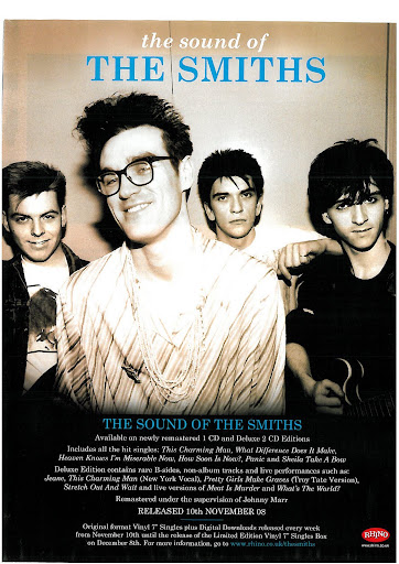
The magazine advert that I've decided to look at is The Smiths. I can see that from this image the main focus is the band, due to the whole band covering the advert. the bands name is also at the top of the advert in bold characters showing the audience that this band are pretty important, due to their name being in block capitals, block capitals have been used in order . The De-saturation shows that this band are gritty and deal with forms of realism in their lyrical content. I can also see that behind the singer the other band members are holding a permanent frown. The hairstyle of each band member also shows me that they are from the 80's and can categorized into the indie genre. I believe that this advert is aimed at a more independent audience, mainly because the band disinterested, which sort relates to that rock-star lifestyle of not caring, I also believe that this Image is aimed at long time fans of the band because in the text is states that this CD has all of their B-sides on it. I also believe that they are trying to appeal to a mainstream audience as well because it states that the CD is full of their hit singles.

No comments:
Post a Comment